
Rossburn
Close
×
Strategy, Brand, Website, Marketing and PR
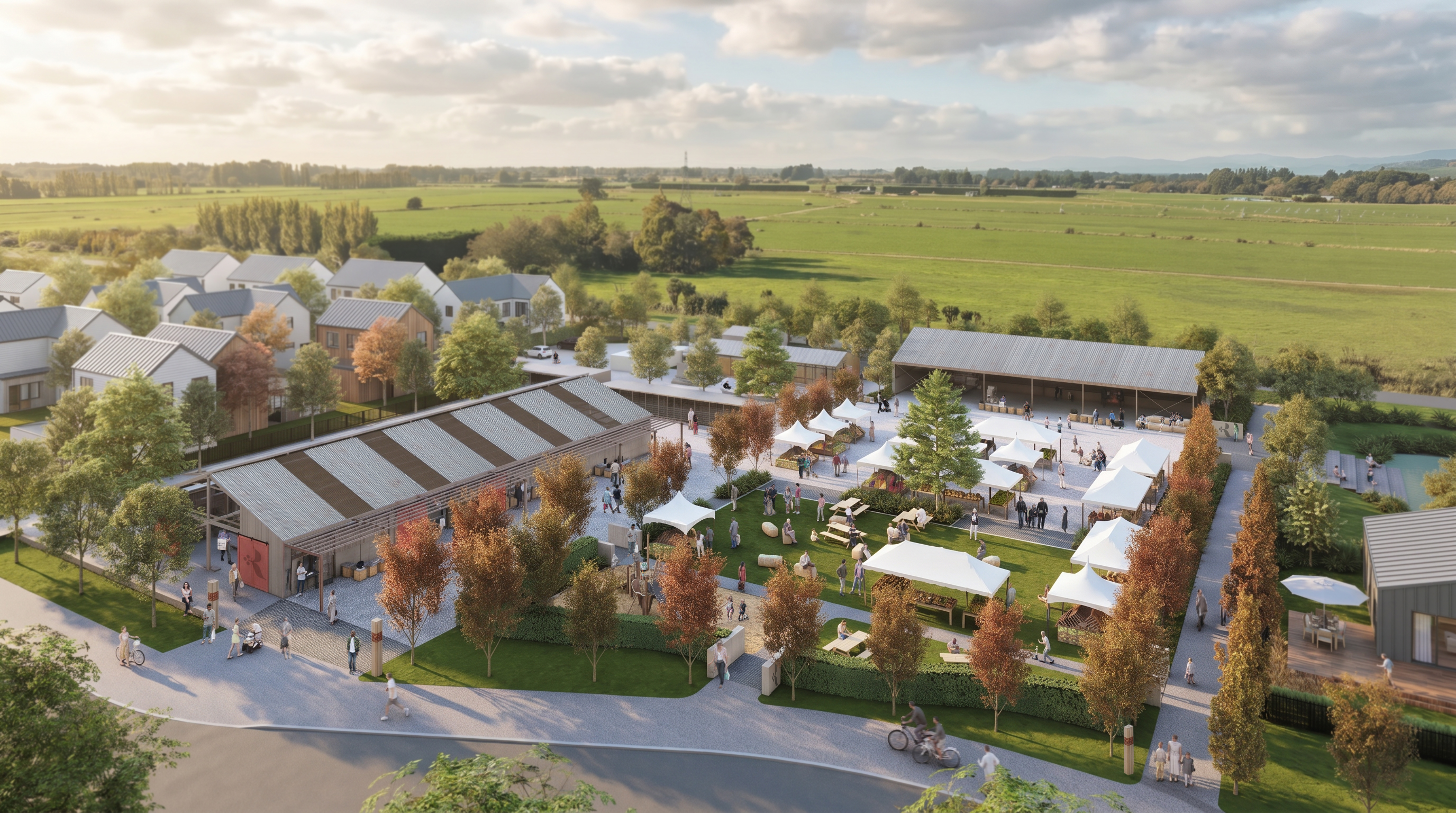
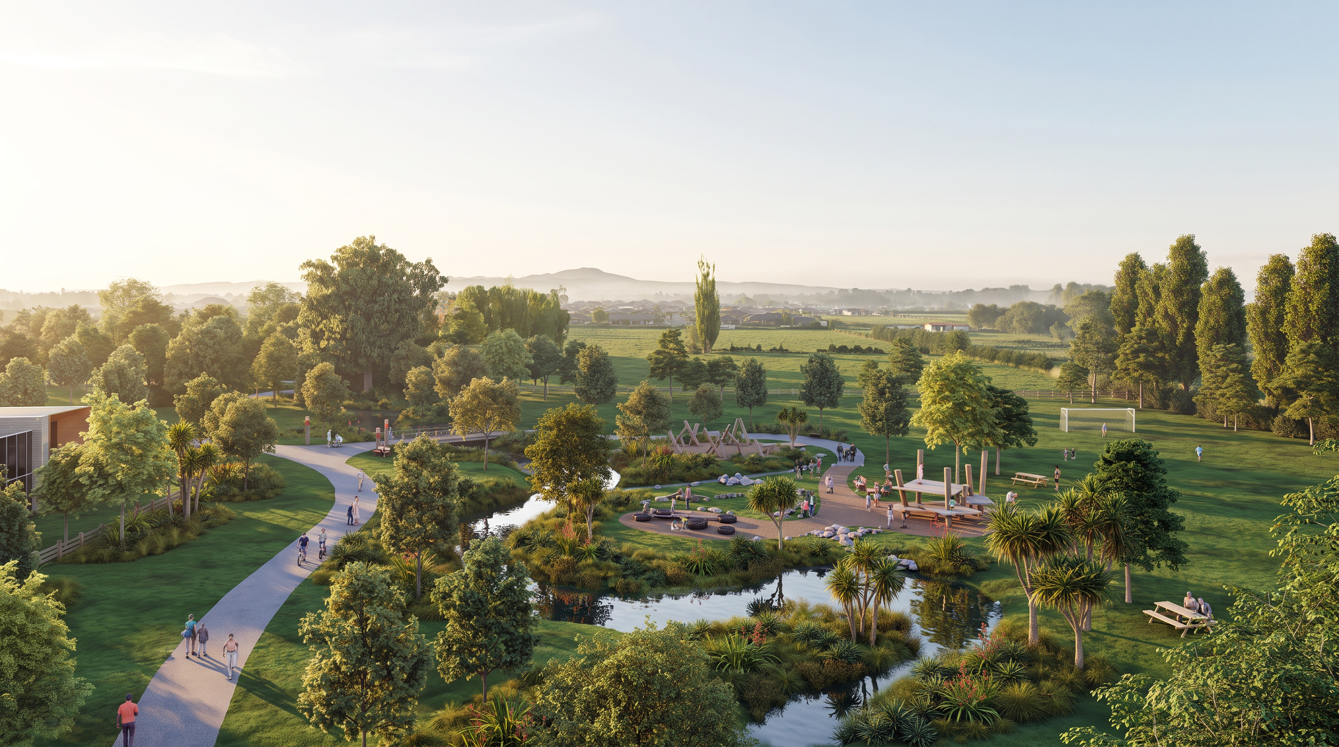
Rossburn sits on farmland that has been in Rangiora family hands since 1870. It's being shaped with the same care — into a 270 homesite community where the Northbrook Wetlands, Northbrook Stream, and views to Mt Grey are part of daily life.
Recreational was tasked with articulating the vision of the client and finding a successful path to market.
Recreational was tasked with articulating the vision of the client and finding a successful path to market.
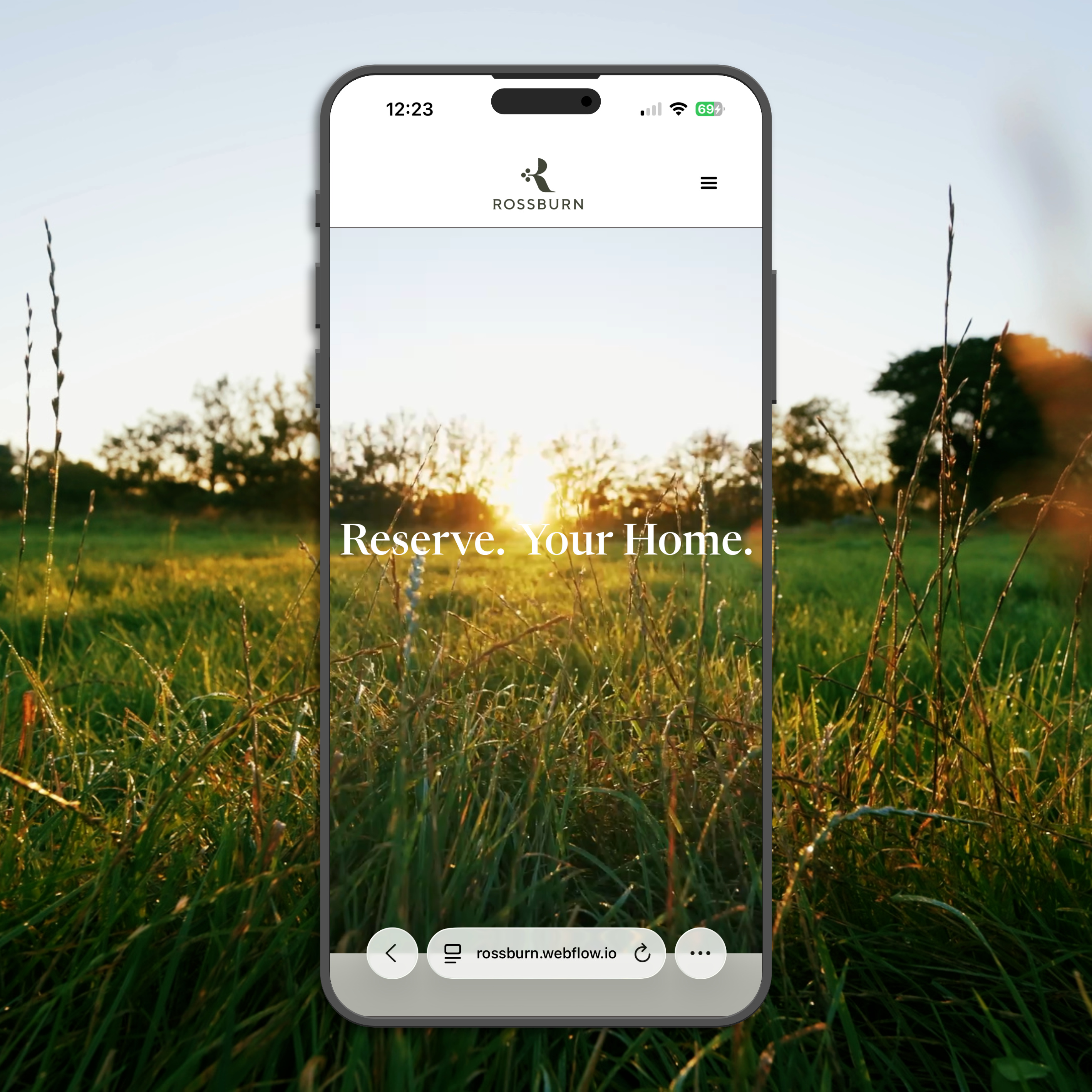
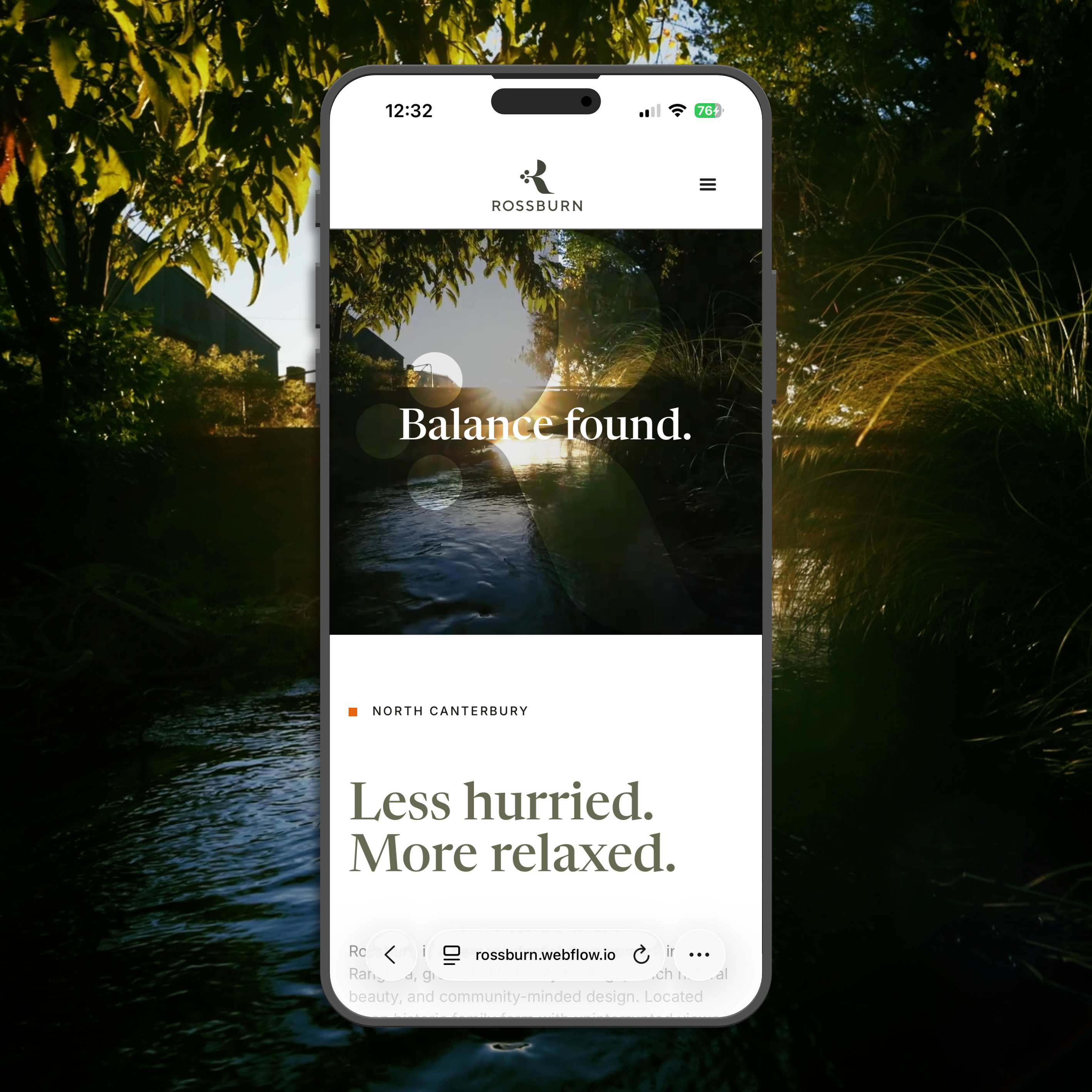
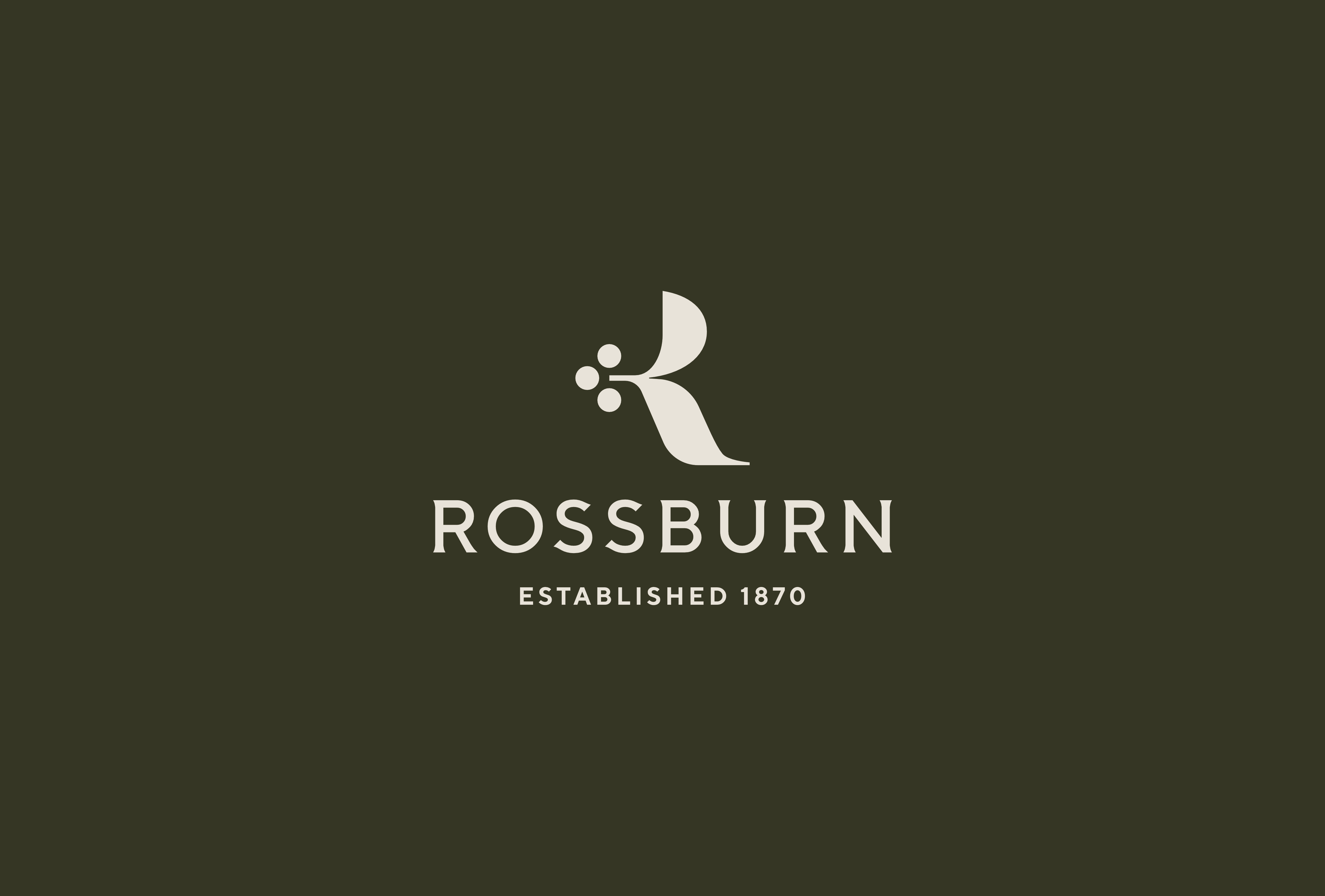

Handmade by Recreational, the sans serif typeface with flare detail keeps the brand feeling modern with a nod to the traditional.

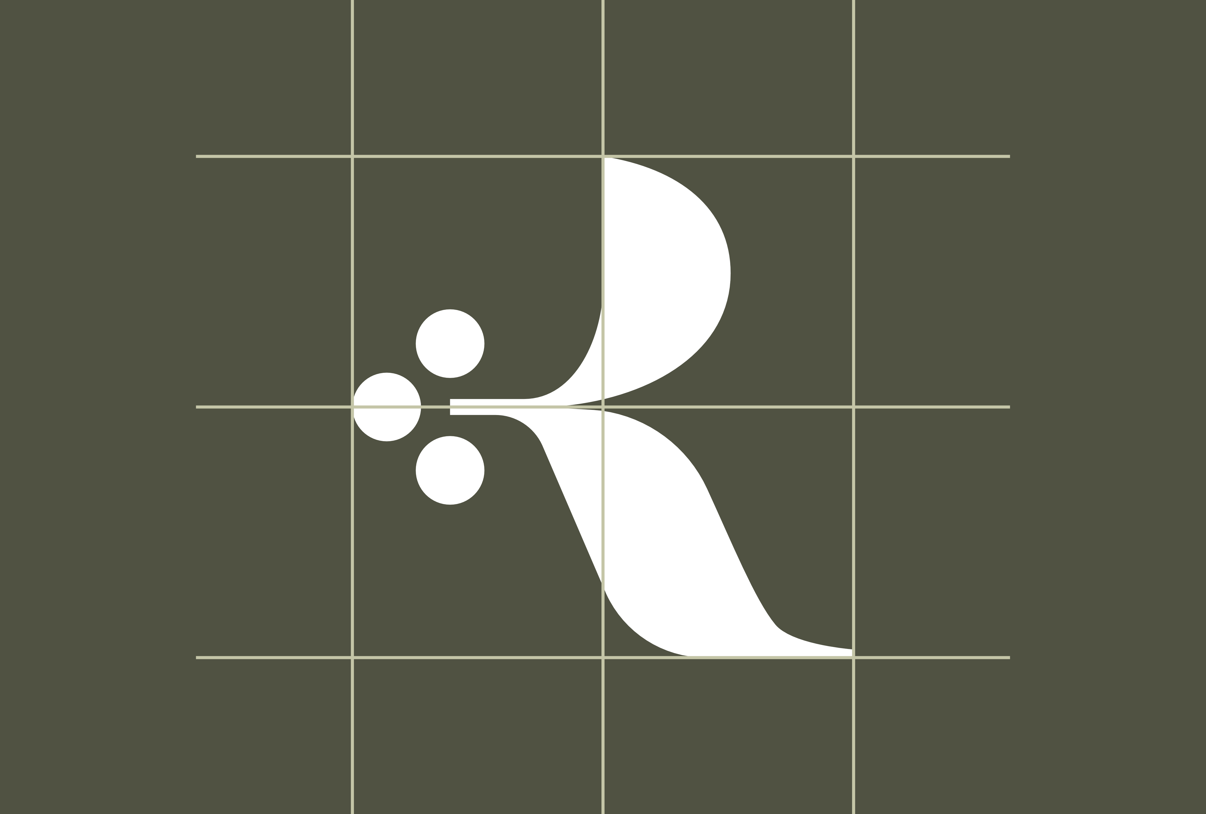
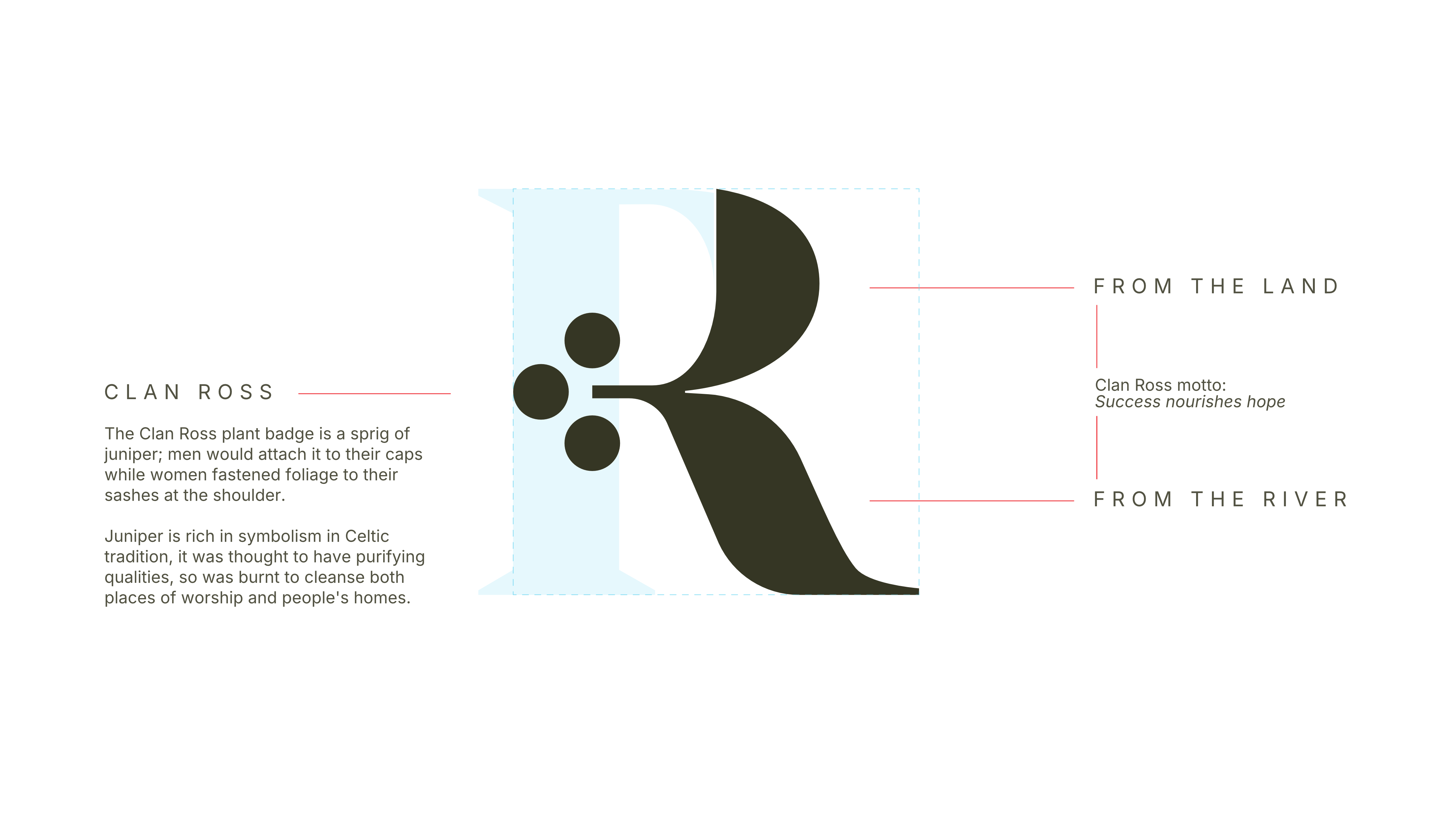
Balance is a recurring theme in the Rossburn development. The logo not only represents the heritage name, it also illustrates the artful composition of urban and environmental design in this large medium density residential development. What appears an organic free form shape is in fact the structured balance found in thoughtful planning, design and development.

The colour palette used is low key, reflecting the light touch on the landscape and a nod to the past. Small pops of colour reference heritage farm buildings and tractors. These colours form part of an identity theme that helps frame the brand story, from marketing to way finding signage.
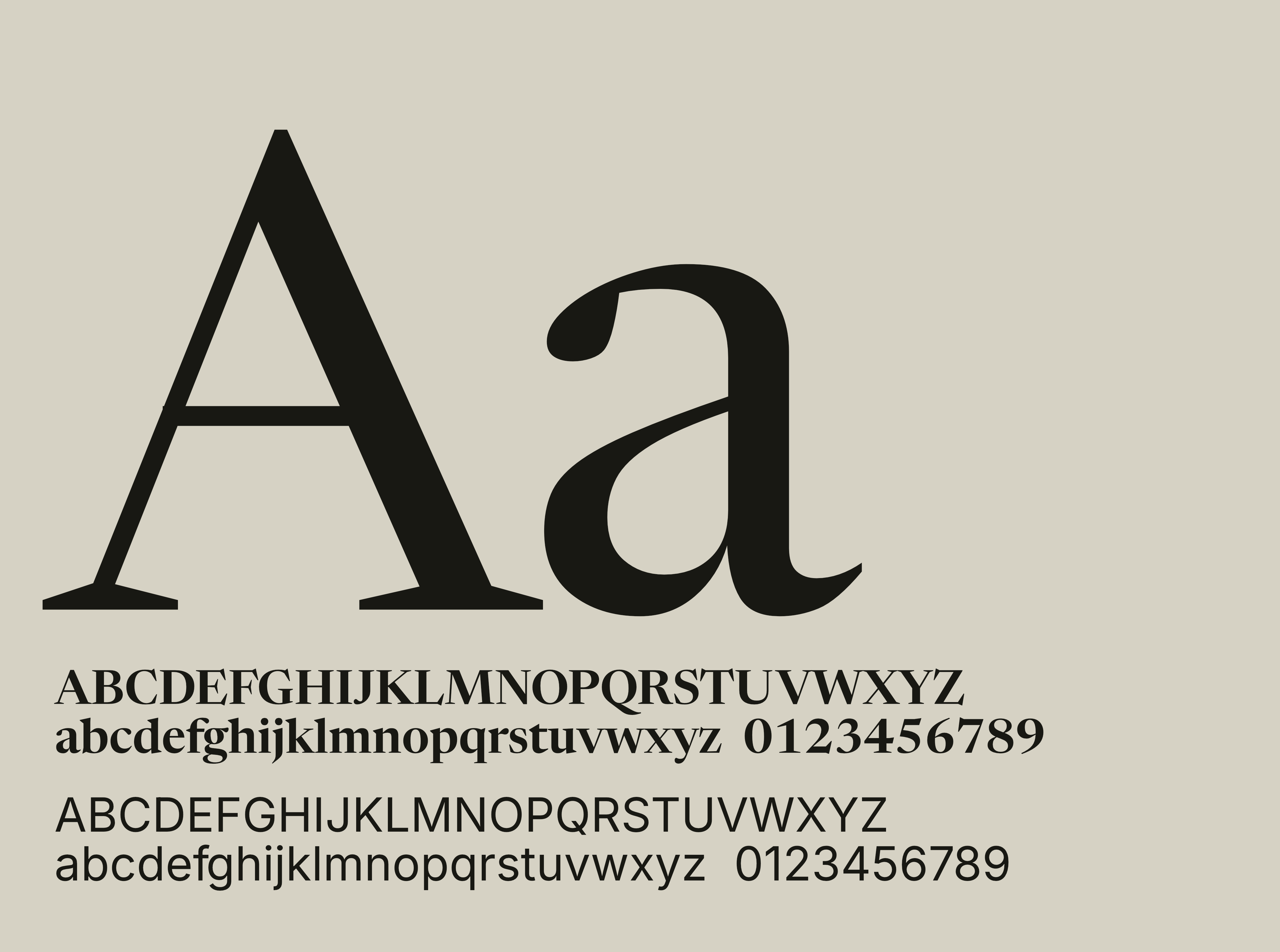
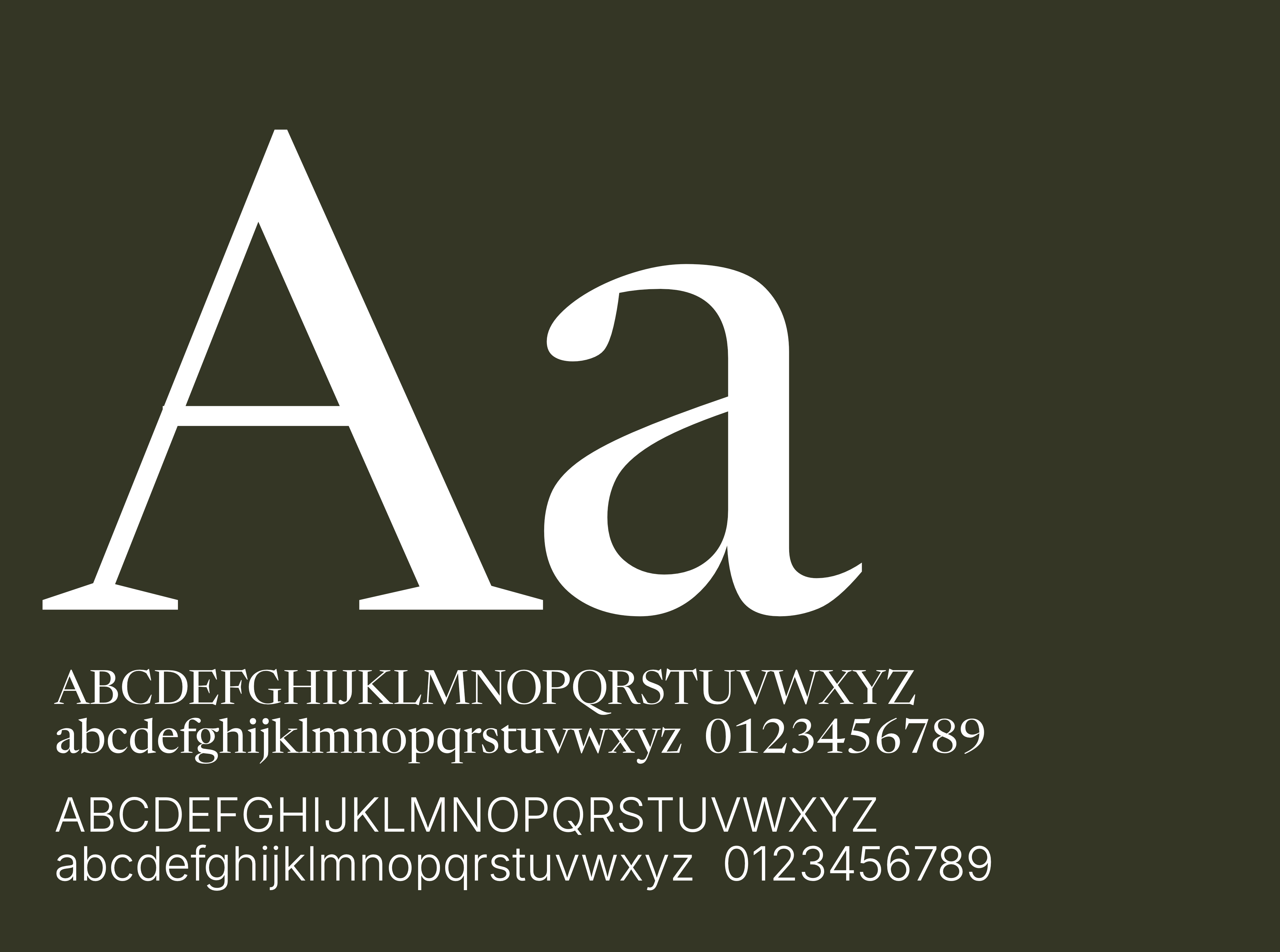
The base typography used throughout the brand marketing is News Reader Display, a classical serif with a little more edge to it, and the clean lines of sans serif of Inter in a support role.
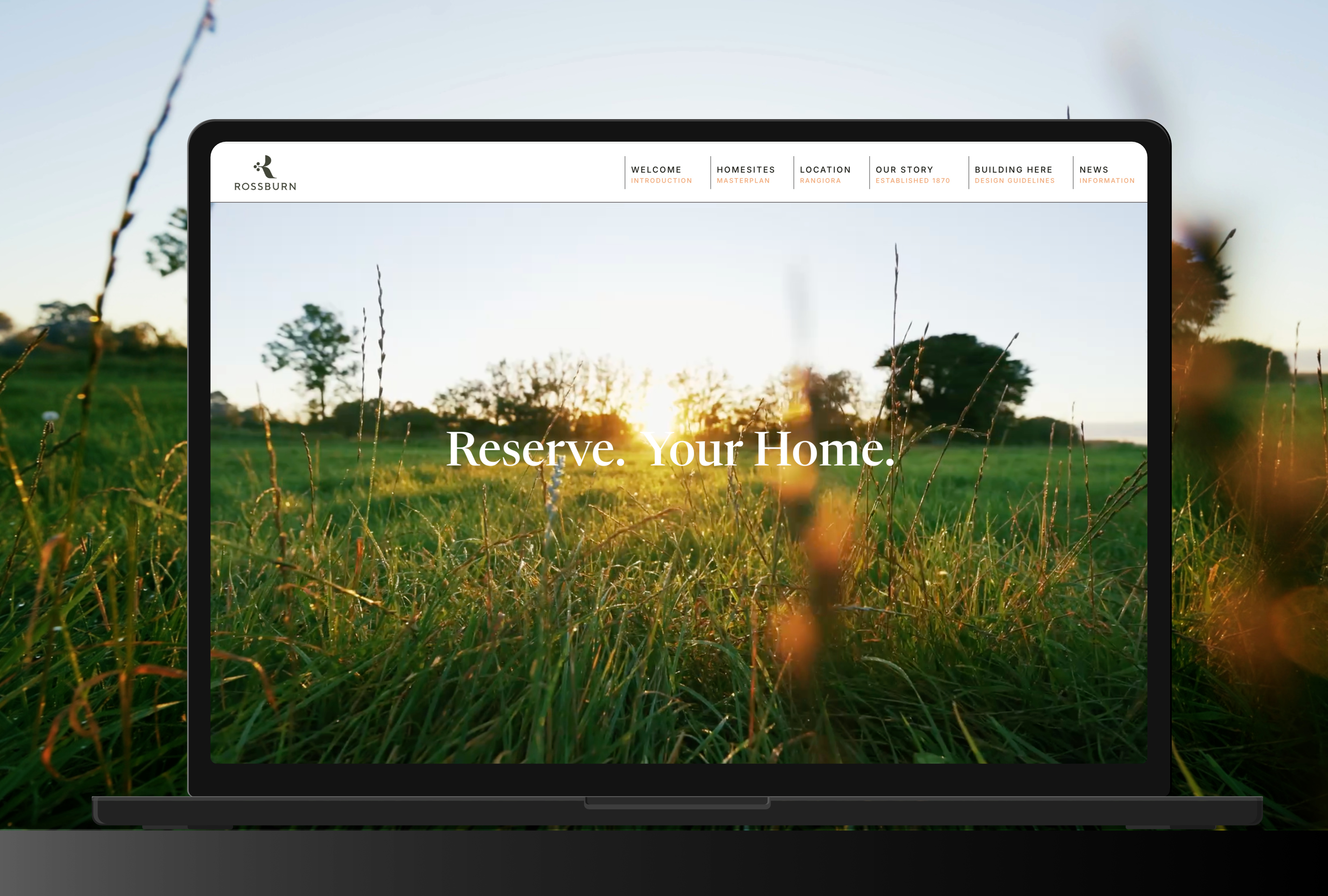
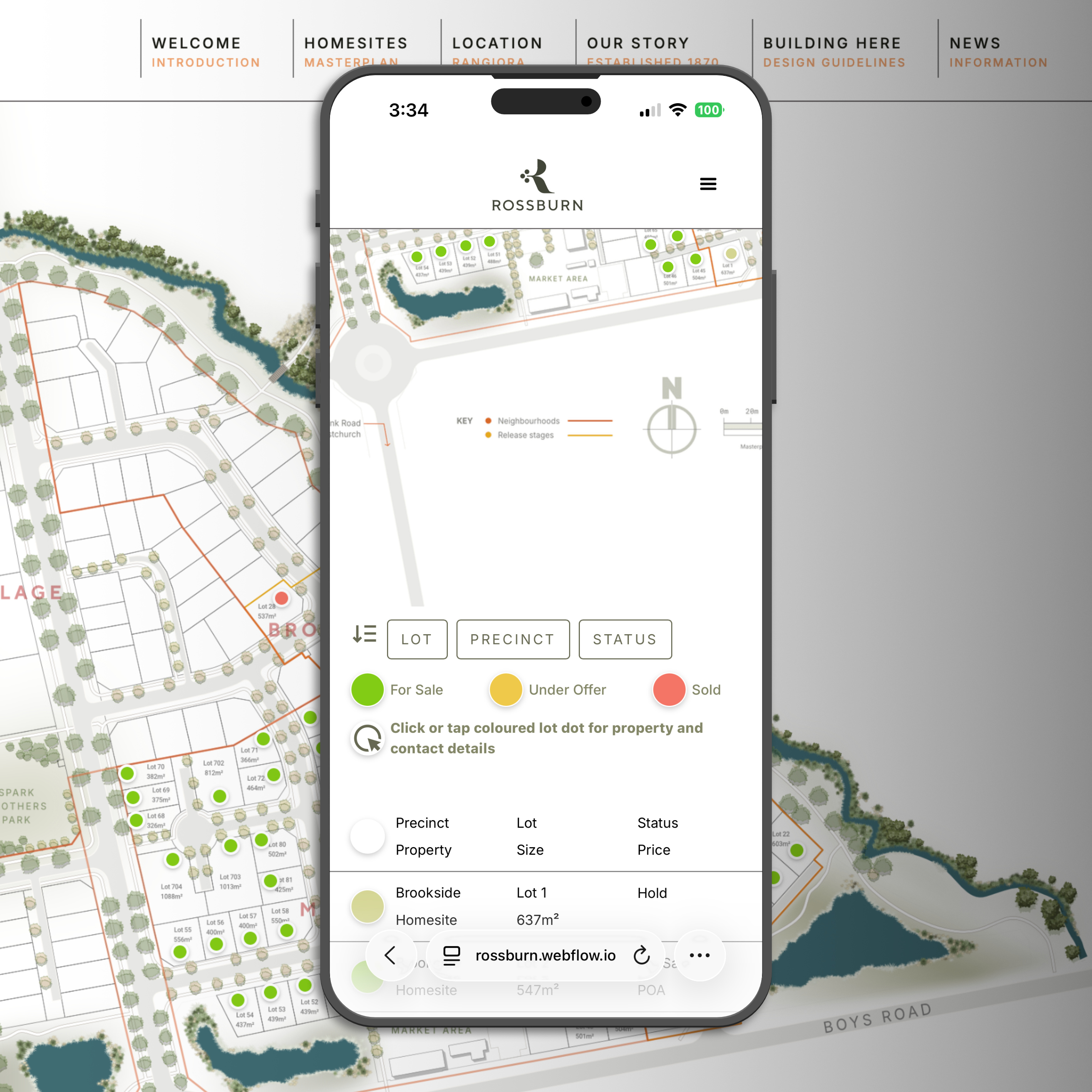

Rossburn uses Recreational's custom property listing app, pulling in sales information on each section lot. Designed for desktop and mobile, the app identifies what's for sale, under contract or sold. As stages are released, the interactive map automatically adds a coloured dot to each lot with a slide-out panel showing the property details and enquiry options.
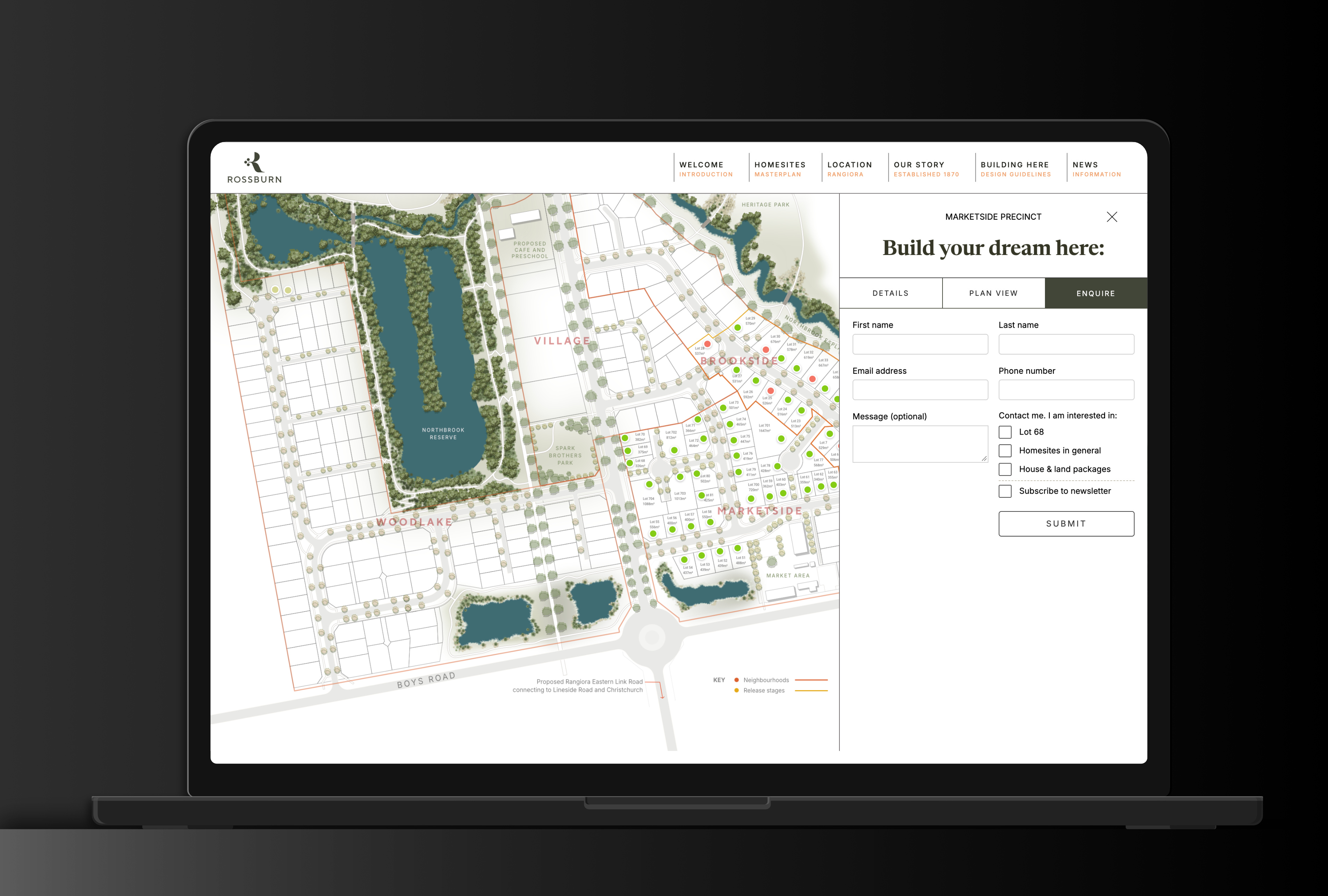

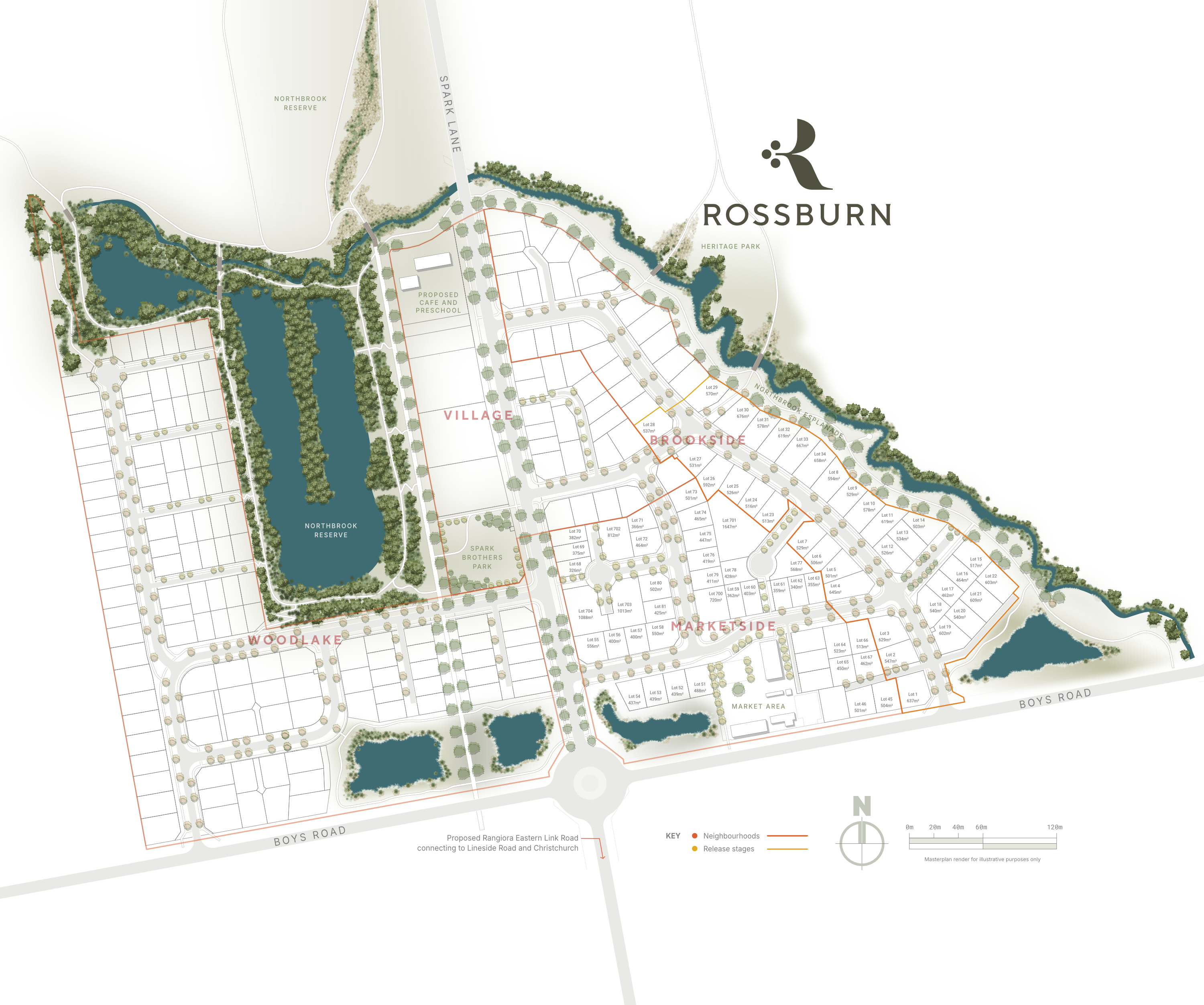
Working with the project urban planners, landscape architects, engineers and client, Recreational designed the marketing version of the masterplan crafted around the brand identity and functionality required for sales marketing.
More Work
Close
×


