Code Snippets
Close
×
Shared learnings
Get in touch or send us your brief.
Squarespace
We are happy to share some of our learnings here, many are simply work arounds to features we wish Squarespace had at the time. Note that Squarespace is constantly improving its own platform and some techniques may become redundant as these become standard features.
CONTENTS
1. Using a SVG header logo in Squarespace
2. Working with SVG files
3. Pull data from a Google Sheet into Squarespace
4. Add a second logo to Squarespace header
5. Two column list section trick
6. Like buttons without a database
Using a SVG header logo in Squarespace
Skill level: Mid level +
Using an SVG for your logo allows you to dynamically change the color of it when your background section color changes. The trick is to put the SVG in a mask so you can use the dynamic color properties for a ‘background-color’.
In this example it’s var(--navigationLinkColor). You can use ‘currentColor’ in the SVG style (e.g. stroke color) in any SVG inside a page Section, but for some reason the header needs a different treatment, which had me stumped until I found this tutorial below on using an SVG in a button. Shout out to Chris at https://schwartz-edmisten.com/ and his tutorial on adding an SVG to a button which lifted the mystery of how the dynamic color is triggered. Chris also showed how to make the SVG a variable so you are not having to repeat so much SVG code in the CSS (for the required two methods of masking). Check his video here, along with his code example on the button https://www.youtube.com/watch?v=XjJA1XWaec0
See below the CSS snippet for 'how to' work with SVG files.
Immedialey below is the basic CSS, which you can adjust to fit the size and shape of your SVG logo:
Tip: Run your SVG code through https://yoksel.github.io/url-encoder/ to make it play nice with CSS.
/* Add SVG Icon To Header */
/* Hide the existing image logo and it's remove height */
.header-title-logo img {
    visibility: hidden;
    height:0px;
}
.header-title-logo a:after {
  @svg: "data:image/svg+xml,
insert your svg code without spaces here";
content: '';
width: 135px;
height: 135px;
display: inline-block;
vertical-align: bottom; //if position link text beneath, otherwise align middle
background-color: var(--navigationLinkColor); /* grab the dynamic color e.g. the nav link color */
-webkit-mask-image: url(@svg);
-webkit-mask-size: contain;
-webkit-mask-position: center right;
-webkit-mask-repeat: no-repeat;
mask-image: url(@svg);
mask-size: contain;
mask-position: center;
mask-repeat: no-repeat;
}Working with SVG files
Skill level: Mid level
If you are new to CSS and SVGs and not sure where to start, this is my workflow for the above example site.
2. Open the SVG using a text editor or code editor. Copy the SVG code and paste it into this free encoder: https://yoksel.github.io/url-encoder/
What you want is the 'Ready for CSS' code, which has removed the blank spaces (SVG's are HTML and we need this in a CSS readable format).
3. In Squarespace, hide the existing logo with .header-title-logo img {visibility: hidden;} (as shown in my post example above).
4. Below this, add the the second CSS class action, which includes the data path to the SVG detail. I'll just explain what's going on here:
A) We are targeting the 'a' tag, but just after it loads, so we use '.header-title-logo a:after'
B) We use a mask (I'll explain why shortly) which has two versions targeting different web browser standards, which means we need to access the SVG data twice. Rather than repeating a lot of SVG code in the CSS, we package it as a variable, a bit like a class of its own you can reuse. The variable in the example above started with '@svg: "data:image/svg+xml,...'. Where you see the trailing dots, replace those with your CSS-friendly SVG you created in step 2 (all those weird characters like '%3C%3F' are necessary space fillers to make the date 'flow' together)
C) The width and height, as well as mask-size will vary depending on your logo size; adjust as you need
D) For the dynamic color I have used the pre-defined Squarespace color variable '--navigationLinkColor'
E) Next in the CSS you'll add your mask-image '-webkit-mask-image: url(@svg);' and 'mask-image: url(@svg);' which is calling on the variable @svg created in step 4-B above.
That's it. If your logo is cropped off, adjust it as mentioned in step 4-C.
Pull data from a Google Sheet into Squarespace
Skill level: Mid level +
A general database in Squarespace is probably in the roadmap somewhere, but in the meantime there's a great (and free) solution using Sheetrock.js which pulls in a Google Sheet to a code block table.
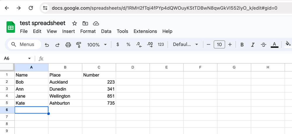
Check out https://chriszarate.github.io/sheetrock/#about for the JS script and documentation. We have implemented this on several Squarespace website and it works perfectly. On the custom CSS we have styled my tables to be responsive, so in doing that removed the sort function from the table for usability, but left in the search.
If you are looking for good responsive tables, check out examples on Codepen (like https://codepen.io/AllThingsSmitty/pen/MyqmdM).
On the custom coded side, we have added a function to Sheetrock.js to change the color of words that match a set criteria (in this example, 'sold' turns red). This approach could be adapted for other styling or functions.
You could also setup a form on your website to post data to the Google Sheet, then pull it back into your website table.
Recreational has produced some smart applications using this base code, including responsive maps with tooltips drawing data from a Google Sheet.
Add a second logo to Squarespace header
Skill level: Mid level
You can add a second logo with a little JS code and CSS.
<!-- Logo on right of navbar -->
<script> $(document).ready(function() { $('<a class="second-logo" href="#"><img src=""/></a>').appendTo('.header-display-desktop .header-actions.header-actions--right');
});
</script>
<style> a.second-logo img { max-width: 70px;}a.second-logo { margin-left: 2.5vw;}
</style>
/* CSS for Header Second Logo */
.second-logo img { /*visibility: hidden;*/}
.second-logo {
@svg: "data:image/svg+xml, ... [add your own SVG data] ...";
content: '';
width: 80px;
height: 50px;
display: inline-block;
vertical-align: bottom;
background-color: var(--navigationLinkColor);
-webkit-mask-image: url(@svg);
-webkit-mask-size: contain;
-webkit-mask-position: center right;
-webkit-mask-repeat: no-repeat;
mask-image: url(@svg);
mask-size: contain;
mask-position: center;
mask-repeat: no-repeat;
}
I also use an SVG on the main logo too. I'll paste the custom CSS for that below:
/* Logo Header as SVG with currentColor theme */
.header-title-logo img {
visibility: hidden;
height:0px !important;
}
.header-title-logo a:after { @svg: "data:image/svg+xml, ... [add your own SVG data] ...";
content: '';
width: 135px;
height: 135px;
display: inline-block;
vertical-align: bottom;
background-color: var(--navigationLinkColor);
-webkit-mask-image: url(@svg);
-webkit-mask-size: contain;
-webkit-mask-position: center right;
-webkit-mask-repeat: no-repeat;
mask-image: url(@svg);
mask-size: contain;
mask-position: center;
mask-repeat: no-repeat;
}
Two column list section trick
Skill level: Beginner level
Use a list section to display what appears to be a two column price list, feature list or cafe menu for example.
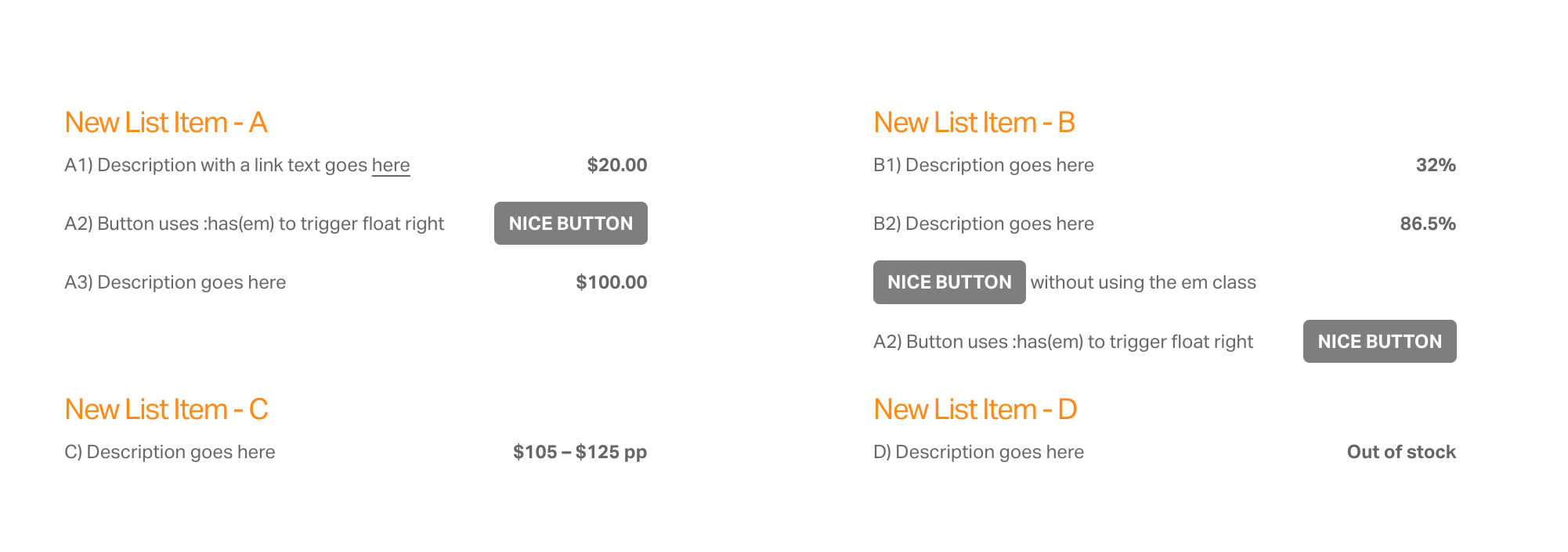

Custom CSS alters the standard Squarespace List Section to two columns:
/* style two column list using SQS lists section */
/* float italic text to right */
.list-item-content__description strong em {
float: right; font-style: normal;}
/* list - override default 75% max-width for mobile */
@media only screen and (max-width: 600px) {
.list-item-content__description {max-width:100% !important;}
}
/* Optional list button */
/* convert underlined link text to button if bold and float right if italics */
.list-item-content__description a strong:has(em) {
float: right; font-style: normal;}
/* style the button */
.list-item-content__description a strong {
padding: 0.25em 0.75em; margin: -0.25em 0 -0.75em;color: var(--primaryButtonTextColor);
background-color: var(--primaryButtonBackgroundColor);
border-color: var(--primaryButtonTextColor);
border-radius: 4px;display: inline-block;
text-decoration: none !important;
text-transform:uppercase;font-size: inherit;}
a) Using italics (em) and bold (strong) together will place that text on the right.
b) Using bold (strong) on a text link will turn it into a button.
c) Add italics (em) to it to place that button on the right.
Like buttons without a database
Skill level: Advanced level
This feature was developed by Recreational to work with the accordion plugin from Will-Myers.com. It can be adapted to work with other lists, not just an accordion.
The actual 'like' button action is inside the accordion item, but the current status of the 'like' is also mirrored in the accordion item title.

After we installed the Will Myres accordion plugin, we added this custom script to Squarespace Web Tools > Code Injection (footer). Note that each item in the accordion needs to be targeted in the code script (as shown below):
<!-- Begin like button and icon code for each lot section --><!-- Like script for accordion list adapted from Jeff Kielman, Codepen -->
<script>
$(".like-false").click( function() {$(this).toggleClass('like-true');
event.preventDefault();});
$(".like-group_btn span").click(function(){
var btnStorage = $(this).attr("id"); if($(this).hasClass("like-true")) {
localStorage.setItem(btnStorage, 'true');
} else {
localStorage.removeItem(btnStorage, 'true');
} });
$( ".like-group_btn span" ).each(function() {
var mainlocalStorage = $( this ).attr( "id" ); if(localStorage.getItem(mainlocalStorage) == 'true') {
$(this).addClass("like-true");
} else {
$(this).removeClass("like-true");
} });
</script><!-- Like button for accordion 'list' -->
<script>
// Button updates the Accordion
// Example button - edit the function name and element ID to match the section:
//function like01() {
// document.getElementById("like-01").classList.toggle('like-true');
//}
// The actual buttons
function like01() {
document.getElementById("like-01").classList.toggle('like-true');
}
function like02() {
document.getElementById("like-02").classList.toggle('like-true');
}
function like03() {
document.getElementById("like-03").classList.toggle('like-true');
}
function like04() {
document.getElementById("like-04").classList.toggle('like-true');
}
function like05() {
document.getElementById("like-05").classList.toggle('like-true');
}
function like06() {
document.getElementById("like-06").classList.toggle('like-true');
}
function like07() {
document.getElementById("like-07").classList.toggle('like-true');
}
function like08() {
document.getElementById("like-08").classList.toggle('like-true');
}
</script>
<!-- Open accordion at specific link ID e.g. https://www.recreational.studio/#like-02-->
<script>
var x = location.hash;
if(document.querySelector(x)){
document.querySelector(x).click();
}
</script>
\e87e):
/* Like icon on accordion title */
.like-false:before, .like-ready:before {
font-family: "Material Icons";
content: "\e87e";
display:inline;
/*font-size:inherit;*/
padding-left:0px;
margin-right:5px;
vertical-align: middle;
color: inherit;
}
.like-true:before {
font-family: "Material Icons";
content: "\e87d";
display:inline;
/*font-size:inherit;*/
padding-left:0px;
margin-right:5px;
vertical-align: middle;
color: var(--primaryButtonBackgroundColor);
}
.like-small {
font-size:24px;
}
.like-large {
font-size:44px;
}
.like-right {
text-align: right;
float:right;
}
.section-name {font-weight:200;text-transform:uppercase}
.section-type {font-weight:200}
.section-type:before {content:"/ ";font-weight:200;color: var(--primaryButtonBackgroundColor);}@media screen and (max-width: 600px) {
.section-type,.section-name {display:block;padding-left: 30px}
.section-type:before {content:""}
}
/* ---- END ---- */
<div data-wm-plugin="accordion">
<button><p><span class="like-group_btn"><span id="like-01" class="like-ready like-small"></span><span class="section-title">Section 01</span></span> <span class="section-name">Blueberry</span> <span class="section-type">Pie<span></p></button>
<button><p><span class="like-group_btn"><span id="like-02" class="like-ready like-small"></span><span class="section-title">Section 02</span></span> <span class="section-name">Chocolate</span> <span class="section-type">Ice Cream<span></p></button>
<button><p><span class="like-group_btn"><span id="like-03" class="like-ready like-small"></span><span class="section-title">Section 03</span></span> <span class="section-name">Apple</span> <span class="section-type">Struddle<span></p></button>
<button><p><span class="like-group_btn"><span id="like-04" class="like-ready like-small"></span><span class="section-title">Section 04</span></span> <span class="section-name">Lemon</span> <span class="section-type">Tart<span></p></button>
<button><p><span class="like-group_btn"><span id="like-05" class="like-ready like-small"></span><span class="section-title">Section 05</span></span> <span class="section-name">Pear and Apple</span> <span class="section-type">Muffin<span></p></button>
<button><p><span class="like-group_btn"><span id="like-06" class="like-ready like-small"></span><span class="section-title">Section 06</span></span> <span class="section-name">Chocolate and Rasberry</span> <span class="section-type">Cake<span></p></button>
<button><p><span class="like-group_btn"><span id="like-07" class="like-ready like-small"></span><span class="section-title">Section 07</span></span> <span class="section-name">Double Chocolate</span> <span class="section-type">Cheesecake<span></p></button>
<button><p><span class="like-group_btn"><span id="like-08" class="like-ready like-small"></span><span class="section-title">Section 08</span></span> <span class="section-name">Rasberry</span> <span class="section-type">Muffin<span></p></button>
</div>
a) Install the Will Myres accordion.
b) Add custom CSS and code.
c) Store 'like' on the users local device.
Tip: You can also target a specific item in the accordion with it's own link. For example /accordion-demo#like-04